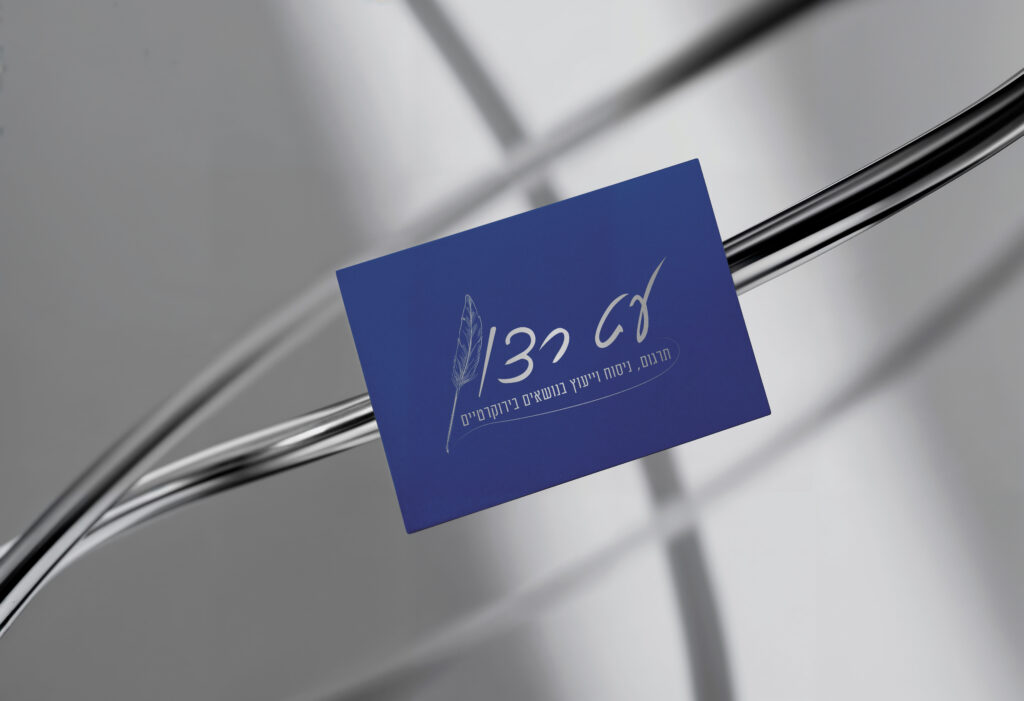
This project focused on creating a visual identity for a private specialist providing translation, writing assistance, and consultations related to communication with government institutions and courts. The logo needed to convey professionalism, clarity, and reliability while remaining approachable for people seeking help with complex bureaucratic and legal communication.
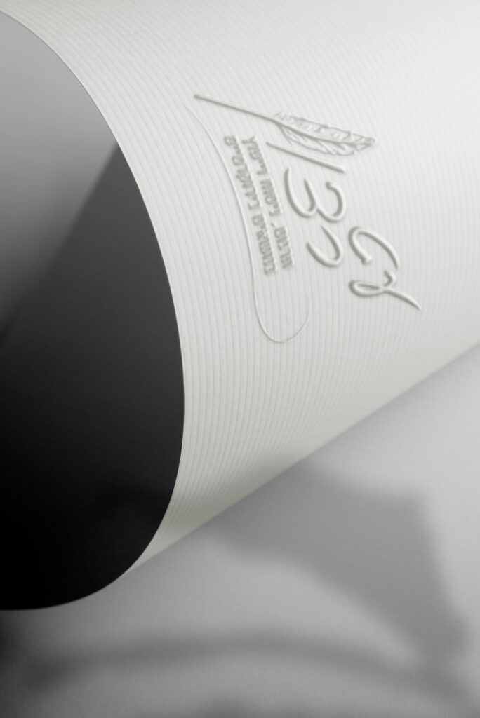
The concept is built around the idea of writing as a tool for precision and thoughtful expression. The letter “ן” in the brand name is replaced with a fountain pen illustration, symbolizing грамотность, careful wording, and an intelligent approach to written communication.
The typography was chosen in a serif style to reinforce the sense of professionalism and formality associated with official correspondence. A minimalist composition keeps the design clear and balanced, allowing the pen element to integrate naturally into the wordmark without overwhelming it.
The final result presents the brand as trustworthy, precise, and attentive to detail — qualities that are essential when dealing with official documents and communication with institutions.