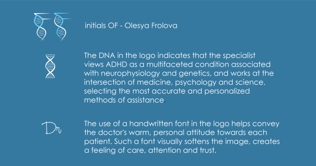
The task was to create a visual identity for a pediatrician whose practice combines clinical medicine with a modern scientific approach to child development and behavioral health. The brand needed to communicate professionalism and expertise while remaining calm, human, and reassuring for parents.
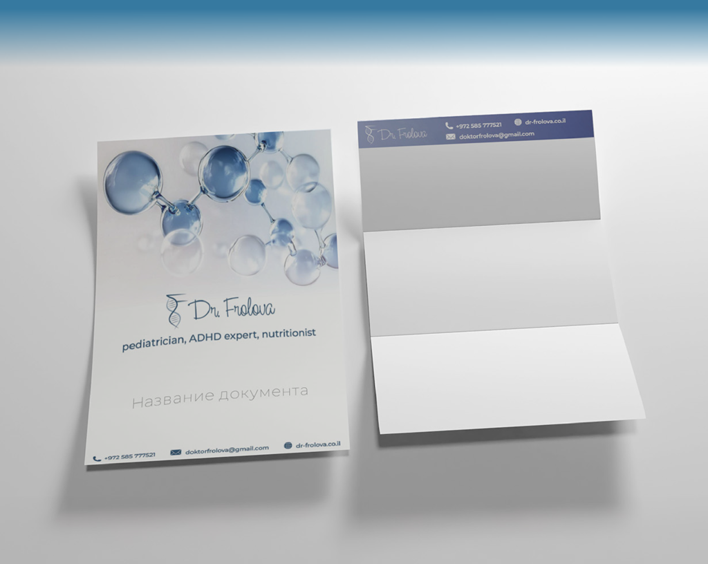
The identity is built around the idea of clarity and structured knowledge. The visual language references molecular forms and fluid organic structures, subtly connecting the brand with science and research while avoiding cold or overly technical aesthetics. Soft shapes and layered imagery create a sense of depth and movement, reflecting the complexity of biological systems and the holistic perspective of the doctor’s work.
The visual system is intentionally light and transparent. A restrained palette of cool blues and neutral tones supports associations with healthcare, reliability, and precision, while maintaining a gentle and approachable atmosphere suitable for pediatric care.
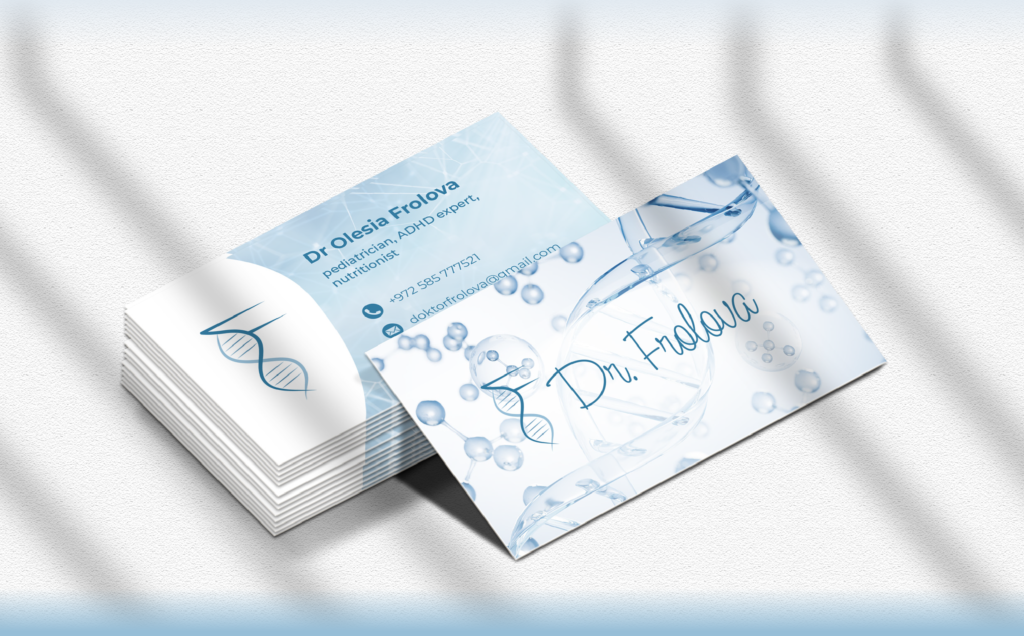
The identity was developed as a flexible system applied across stationery, professional documents, and digital communication. Consistent use of visual elements allows the brand to remain recognizable while adapting easily to different formats and contexts.